洞天 The Cave|水木室內設計
DECO TV
撰文者 - DECO TV 編輯部
資料暨圖片提供 - 水木室內設計 - 全案規劃事務所
洞天 The Cave|水木室內設計
本案為新建單層住宅規劃,室內面積約 165 平方米。
This project is a new single-story residential plan with an indoor area of approximately 165 square meters.
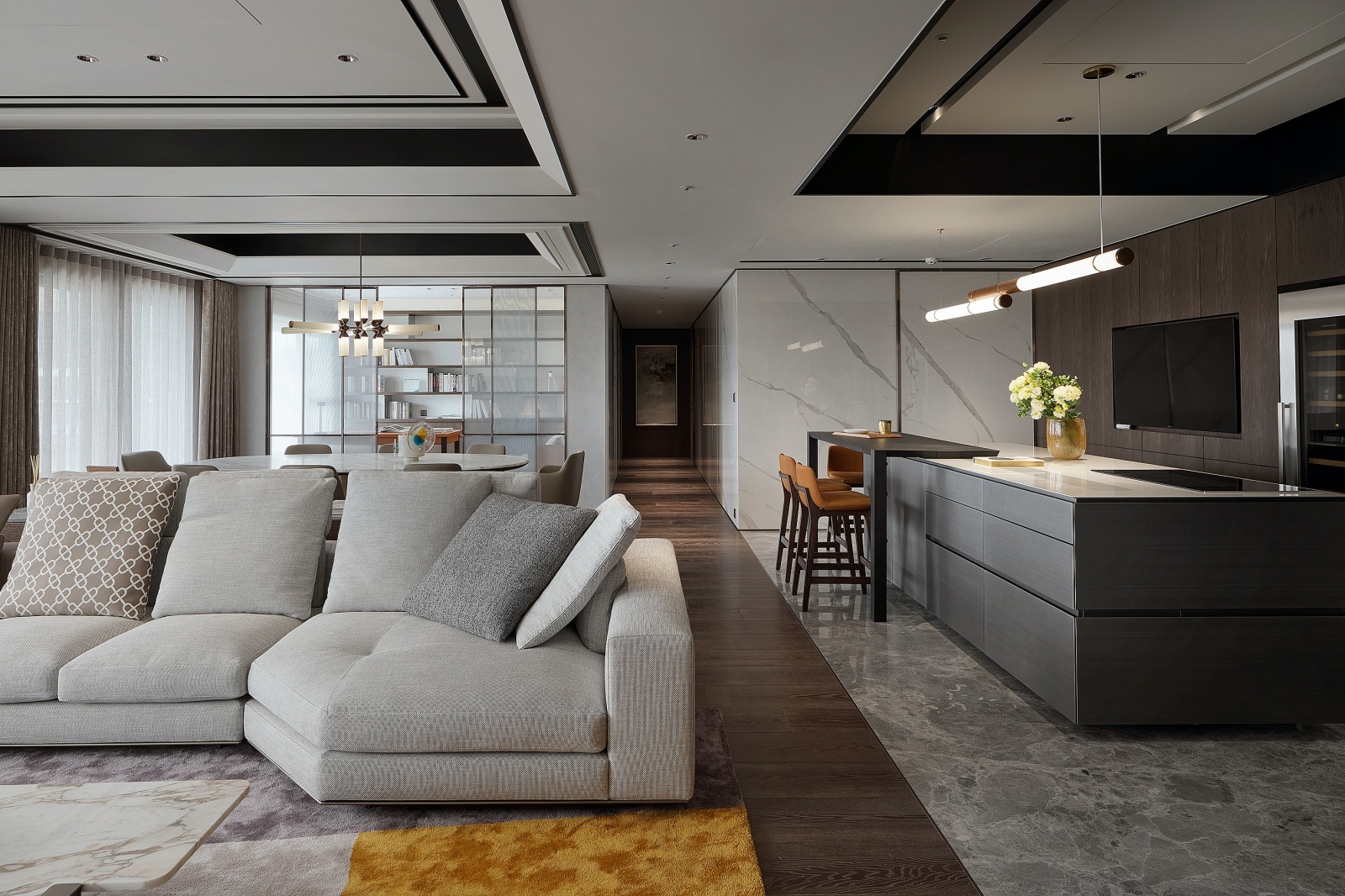
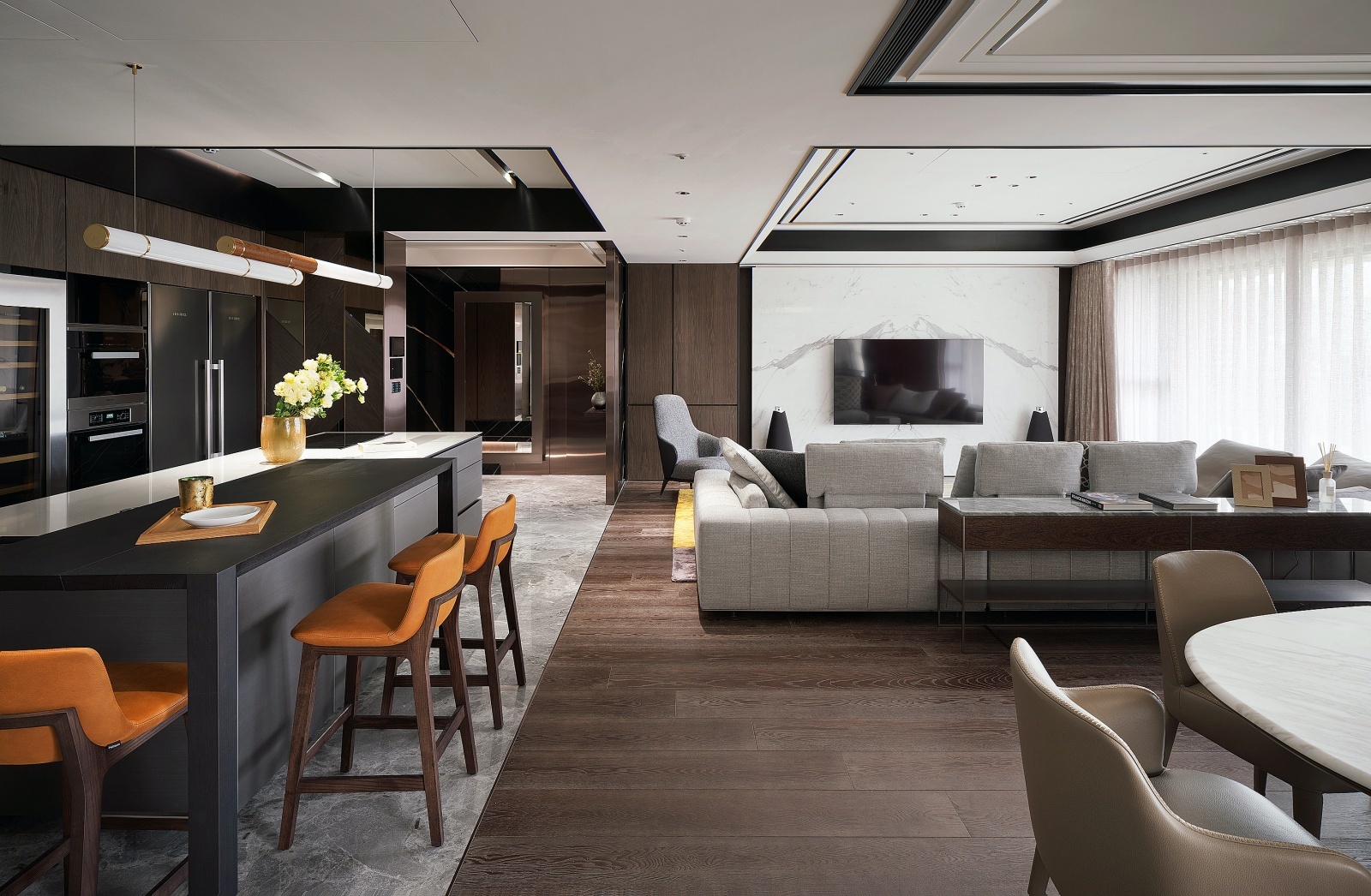
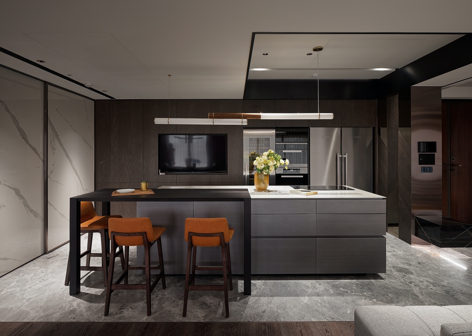
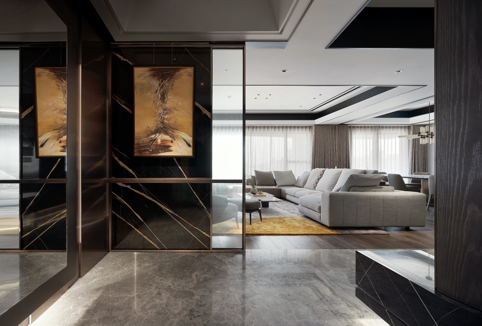
進門玄關運用高立櫃與鈦金穿鞋區,屏障直入中島輕食區視線,另特製黑金石材包框屏風端景,順勢引導動線進入公領域。有鑒於此區巨大橫樑經過,設計上採用黑白對比、斜收穹頂與線條粗細層疊等技巧,順勢打造分區天花板立體造型,兼顧最佳淨高度、場域屬性劃分,同時消弭樑的存在感。此外,中島輕食區為使用者最常駐足熱點,後靠一列家電櫃暨視聽牆流露洗鍊科技感,實作上則是善用結構進退差整合而成。
The entryway features tall shelves and a titanium shoe-wearing area. The view of the island"s casual dining area appears immediately following the screen. The terminal view is cut off by a specially constructed black and gold stone-wrapped screen that directs movement into the common area. As a large beam runs through this space, the design makes use of a black-and-white contrast, sloping dormers and thick and thin layers of lines to create a three-dimensional shape for the zoned ceilings, taking into account the best net height and delineation of space properties, while also removing the beam"s presence. The island, which has a row of appliance cabinets and an audio-visual wall in the back to reveal a sense of sophisticated technology but is actually integrated with structural advancement and retreat, is also the most popular gathering place for users.
其次是體現高度客製化的設計靈感,設計師藉由「趙無極」的畫作結構及色彩,進而發展出沈穩演色與相關材質搭配,另結合敏銳藝術嗅覺、精湛工法和多重先進數位科技;促成委託方既有生活記憶、個性品味、當代文化、獨家審美與未來觀的完美契合。
Second, a highly adaptable design inspiration has been realized. To create a consistent color rendition and use of complementary materials, the designers drew inspiration from the composition and palette of Zao Wou-ki"s paintings. Additionally, it combines a keen artistic eye, excellent craftsmanship and numerous cutting-edge digital technologies. It seamlessly fits into the client"s past experiences, aesthetic preferences, modern culture and outlook on the future.
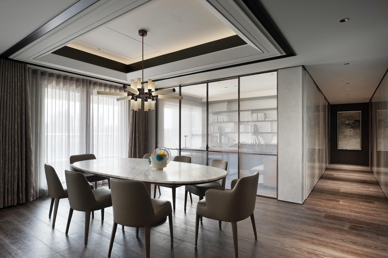
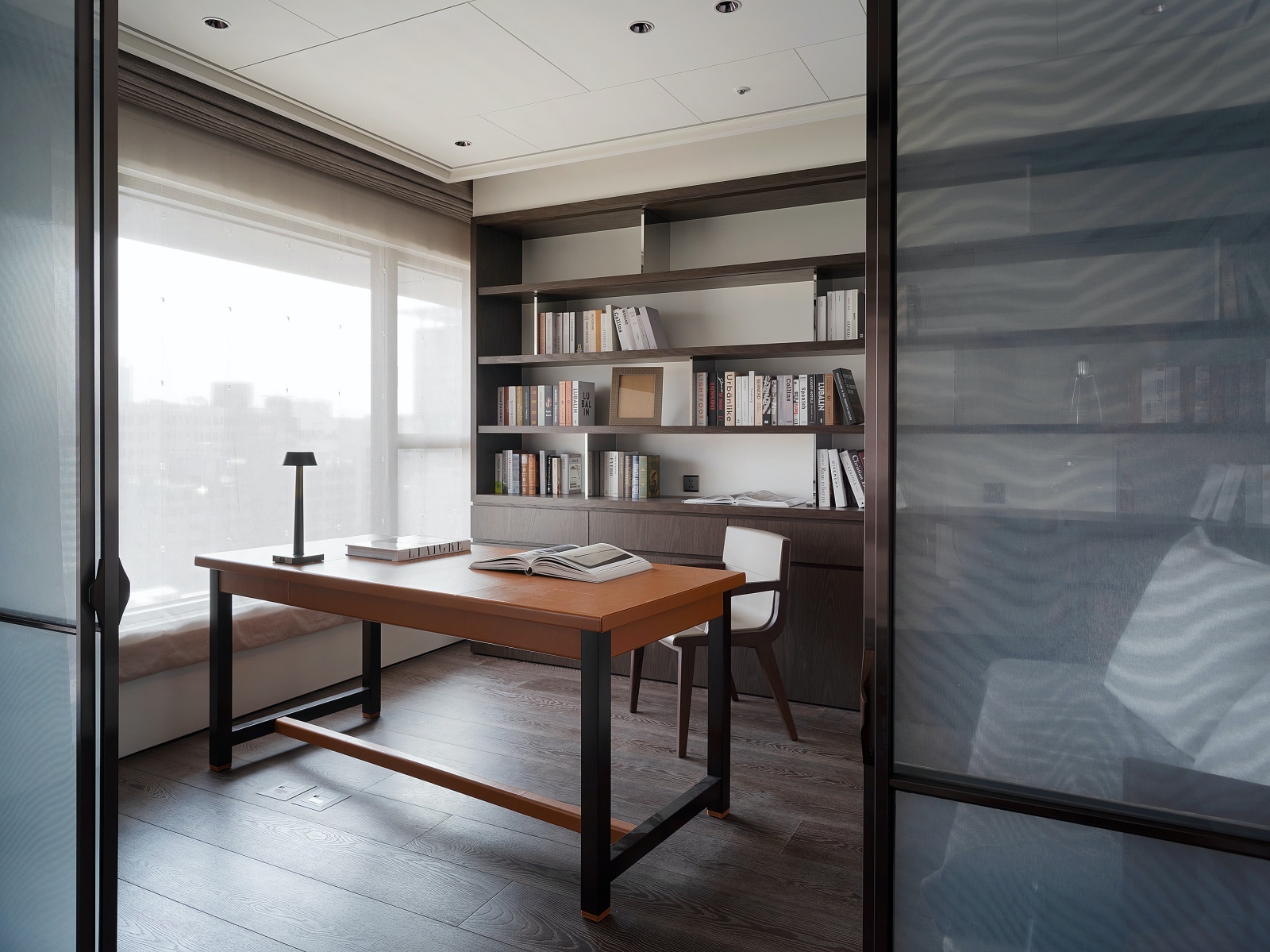
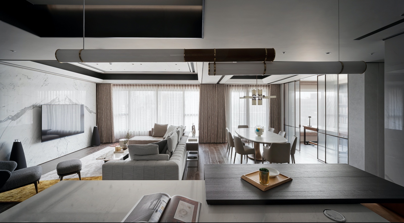
初期根據委託方平時居住成員簡單;十分講究生活質感、儀式性,且時有聚會、交誼等需求,個別打造機能完善且景深開闊的公領域,以及均為全配套房規格的兩間臥室。
The client initially stated that the typical make-up of the household was simple. They have a strong commitment to life quality and rituals and socializing and gatherings are occasionally necessary. The common areas are individually designed to be fully functional and have an open view. The two bedrooms are fully furnished suites.
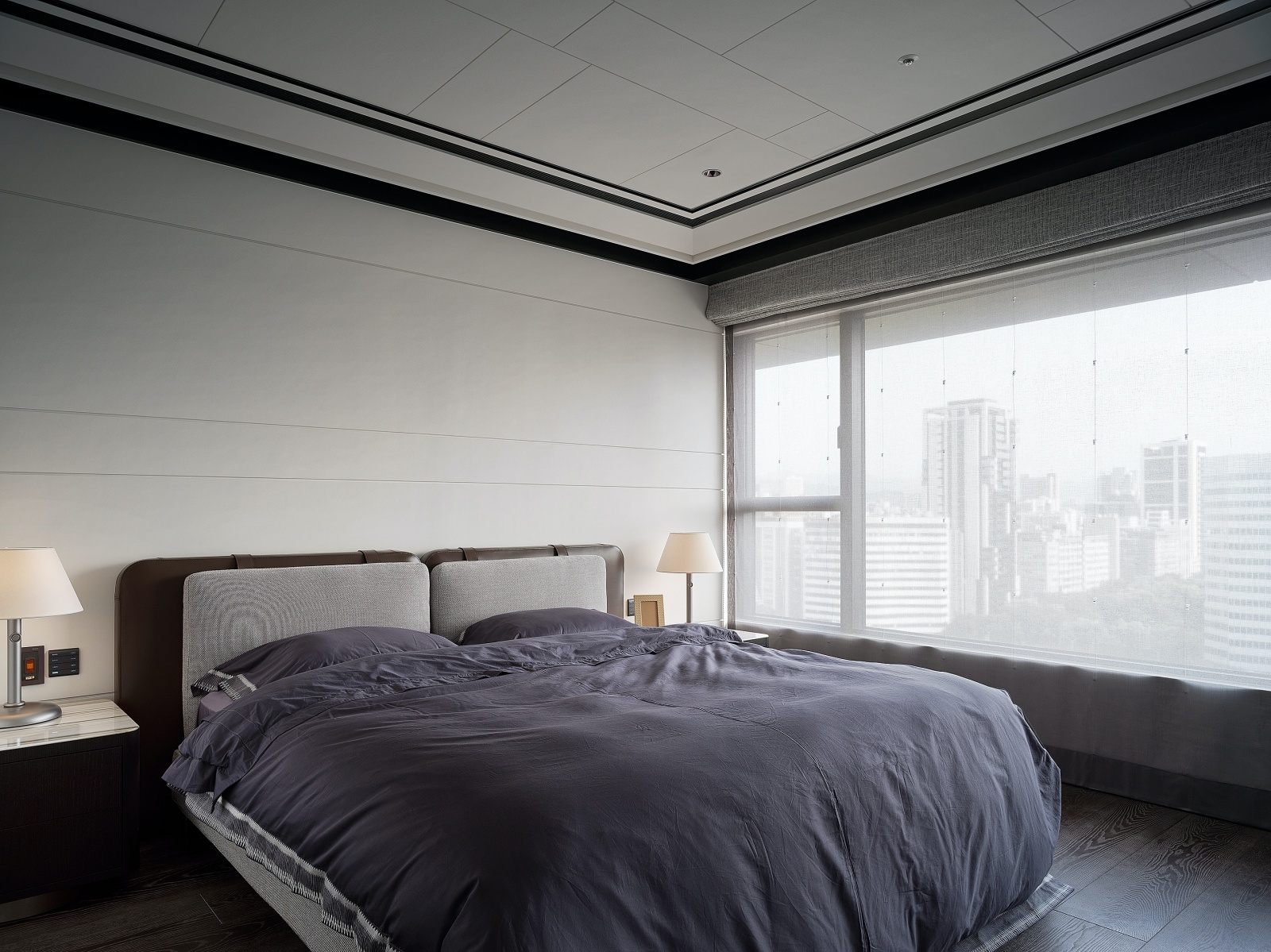
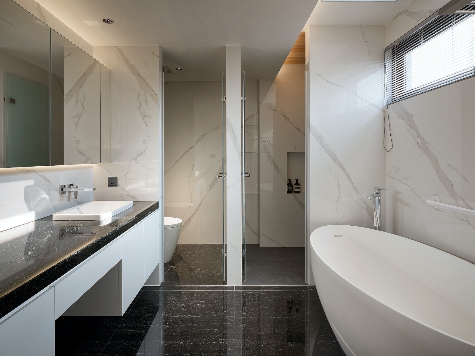
空間必須為人服務,「人」與「家具」是永遠的空間主角,皆是本案不變邏輯核心,因此實作之前;優先配置全室家具軟裝、燈具、地毯、藝術品等項目,為實踐作品高完成度的關鍵,例如客廳顛覆傳統沙發配置,從室內設計及空間材質變化,衍伸出沙發模塊與整體區域的搭配及對話,以便更好地滿足使用者好客、迎賓需求,同步彰顯不凡品味。
People must come first in space; this project"s logic is based on the idea that"people"and"furniture" will always be the focal points of any design. As a result, prior to starting the actual work, emphasis was placed on how the furniture, soft furnishings, lighting, carpets, artwork and other items were arranged throughout the entire apartment.This was done in order to follow best practices and ensure a high level of work completion.
來源:《DECO TV》10 月
更多精彩內容請至 《DECO TV》
- 掌握全球財經資訊點我下載APP
- 講座
- 公告
上一篇
下一篇